When browsing for routes or using the route planner, you’ve surely noticed the 3 buttons in the top right corner on the Bikemap website, which you can use to switch between different base maps and layers providing additional information. But what do the numerous colourful lines and points on those maps mean? We have compiled a short overview that tells you everything there is to know about Bikemap’s base maps and makes discovering new routes even easier!
Bike paths and heatmap
The bike path button puts a layer of bike paths over whichever base map you’re using. The paths’ colour varies between green and a red-brownish colour: Green means that there’s a cycle path that’s reserved for cyclists only, whereas yellow represents a lane that’s shared by bikes and cars. A red-brownish line equals a well-trafficked street without a designated area for cyclists. The heatmap button shows how popular and hence how busy the pictured streets are. You can find more information about the heatmap here. These two buttons are useful overlay tools that provide you with additional information about your map section which you can fade in and out as you wish. The button on their right side is used to switch between 5 different basemaps.
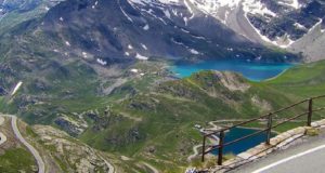
1. Relief Map
The Relief Map is the perfect starting point for those who like to plan long rides in the mountains and don’t hesitate to tackle steeper slopes. Mountainous areas are easily recognised and marked by contour lines (visible when zooming in) that provide information about the elevation and steepness of the area.
2. Open Street Map
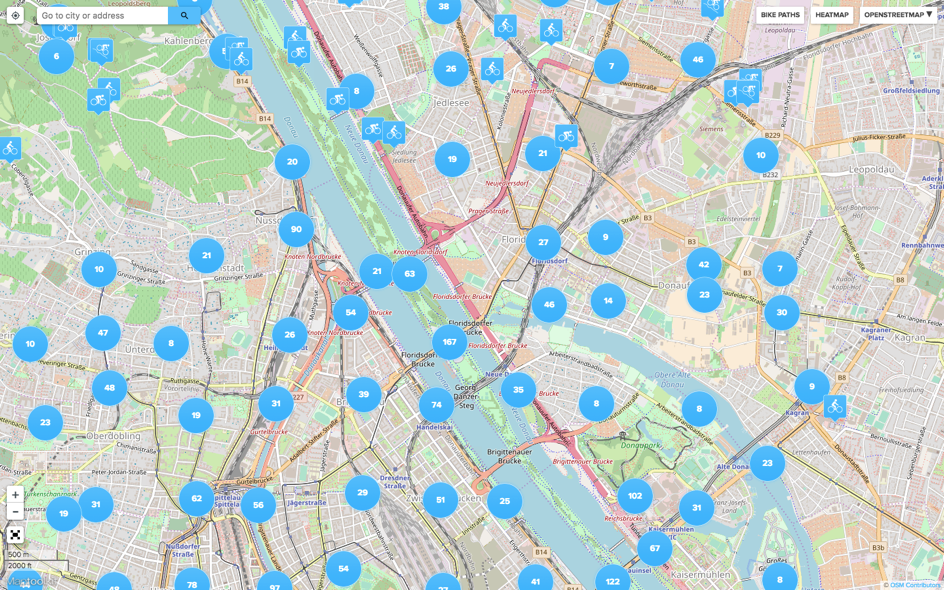
Open Street Map has posted an extensive legend online which you can access here. Cycle paths in this map are represented by blue dashed lines. Especially useful: Routes and stations of tramways, trains and the underground are also marked in the map and are easily identified (just follow the grey lines – blue-gray squares mark every station). Those who are overwhelmed by the many colours used in the map can use the bike path layer to identify cycle paths more easily.
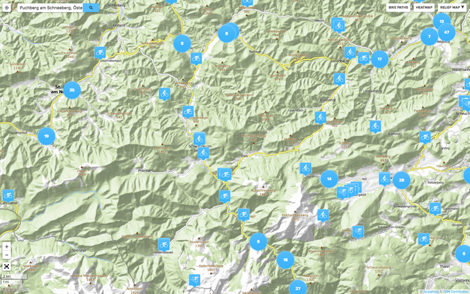
3. Open Cycle Map
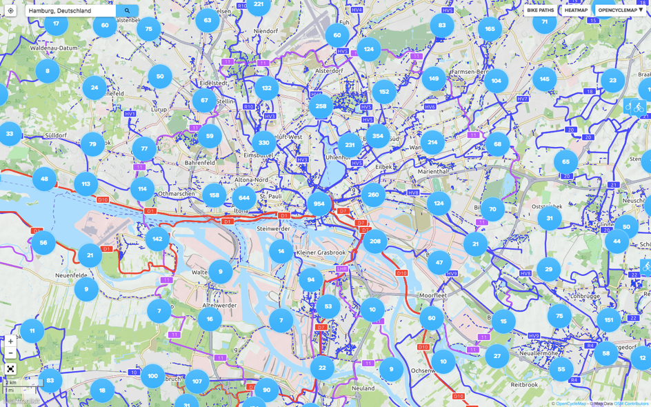
Open Cycle Map is based on Open Street Map and shows a network of national (red), regional (purple) and local cycle paths (blue) upon zooming out. When zooming in and taking a closer look, cycle paths are represented by blue dashed lines, whereas foot paths are shown as red dashed lines. Additional information that could be relevant for cyclists, such as bike shops, drinking fountains, shelters and public toilets, is illustrated and located by symbols. Open Cycle Map is ideal for planning longer bike trips and is only accessible for Premium users.
4. Google Roadmap
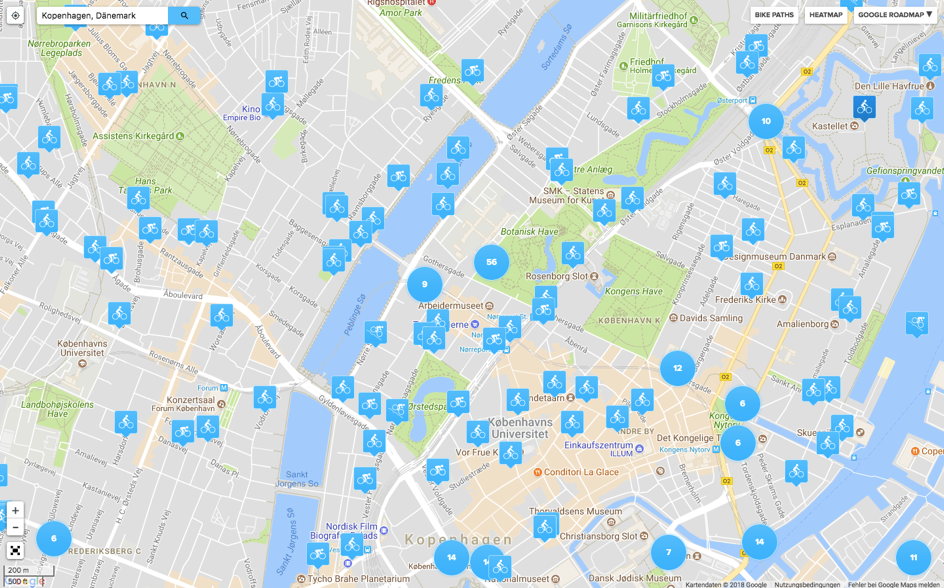
The Google Roadmap’s interface is well-known through Google Maps and likely the easiest to use for all creatures of habit who don’t want to get used to the look of another map. POIs are easily recognisable as small symbols with labels. Using the bike path or the heatmap overlay is especially helpful here, as this map doesn’t show any cycle paths.
5. Google Hybrid
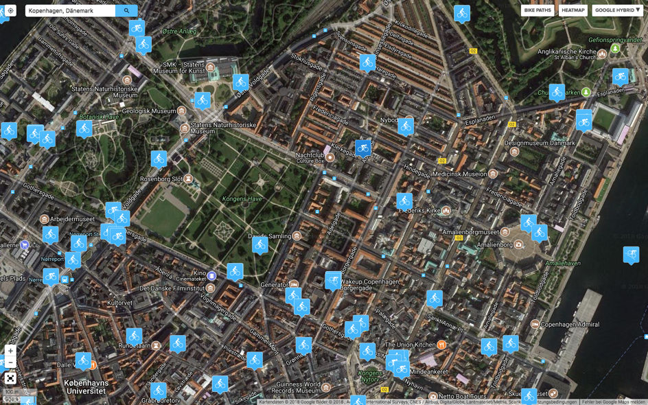
The Google Hybrid map unites the roadmap’s POIs with satellite pictures that show what the area actually looks like. Switching between different maps and the Google Hybrid map gives you a detailed glimpse into the area’s features.
Have fun discovering new amazing routes! 🗺
- The Top 5 Cycling Destinations in 2020 - January 14, 2020
- Your First Long Bike Ride – 200km and More - January 11, 2020
- 4.5M – The World’s Largest Cycling Route Collection - November 21, 2019